
Timeline: March 2019 – Sept. 2023
I used: React, Redux, Nivo Charts, SCSS, GraphQL
The WrapStat application allows school administrators to create, deploy, track, and report surveys given to students and caretakers. While 3C Institute is a SASS company offering basic data collection and reporting functionality as part of their core product, the WrapStat project was one of the most complex applications developed by the company. WrapStat pioneered the adoption of many tools and libraries now used by other apps offered by 3C.
I built the WrapStat front-end as part of my work with 3C Institute. 3C was contracted by the University of Washington to develop an application for their WrapTrack program which is in use by hundreds of school districts around the United States.
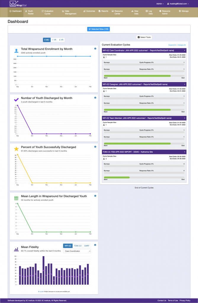
The Dashboard View
The dashboard provides administrators with a bird’s-eye view of their organization. This page was 100% custom. I designed and implemented all the components seen here using open source chart libraries and custom CSS.
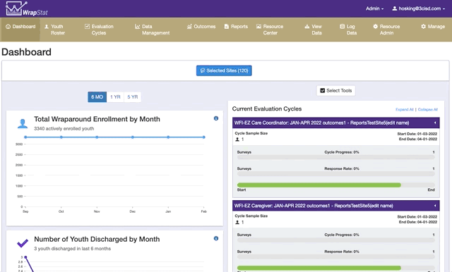
The Site Selector
In many places throughout the app, admins will want to filter the data by the various groups in their organization. I proposed the Site Selector component as an intuitive solution to allow users to quickly find and select groups. The react-checkbox-tree package resembles a filesystem hierarchy which is familiar to most and encapsulates the relationship between sites and their parent groups.
Multi-Page Form
I created a multi-page form wizard for administers to use for rostering students. There are many required forms so instead of a single form with many, many fields, I proposed a multi-page form. This was the first time a multi-page form was implemented in the company’s software stack and the code has been used a reference for subsequent apps. I used redux-form wizard to implement this.
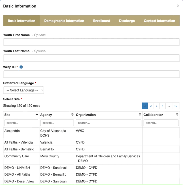
The youth-records created by the form are displayed in a table. There is a tab for each section of the form wizard that renders a table with the columns for that section of the form.

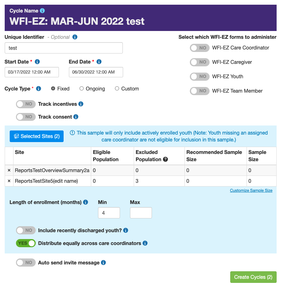
Dynamic Forms
This is the “Create Evaluation Cycle” form. It allows admins to configure the terms of a survey deployment. They can set the period which the survey is active as well as determine the sample size for survey respondents. This form was steeped in business logic and I had to show/hide certain elements within the form based on selections made within the same form.
The students who received the survey were often chosen at random. This was done in the front-end as well and I had to implement all the business logic to determine if a student is able to take the survey.
With what I learned implementing this form, I would never suggest doing all this logic in the front-end. Instead of doing massive data processing on the client (with little to no benefit), I would prefer to query a backend route for this data even if it meant more latency in showing results.
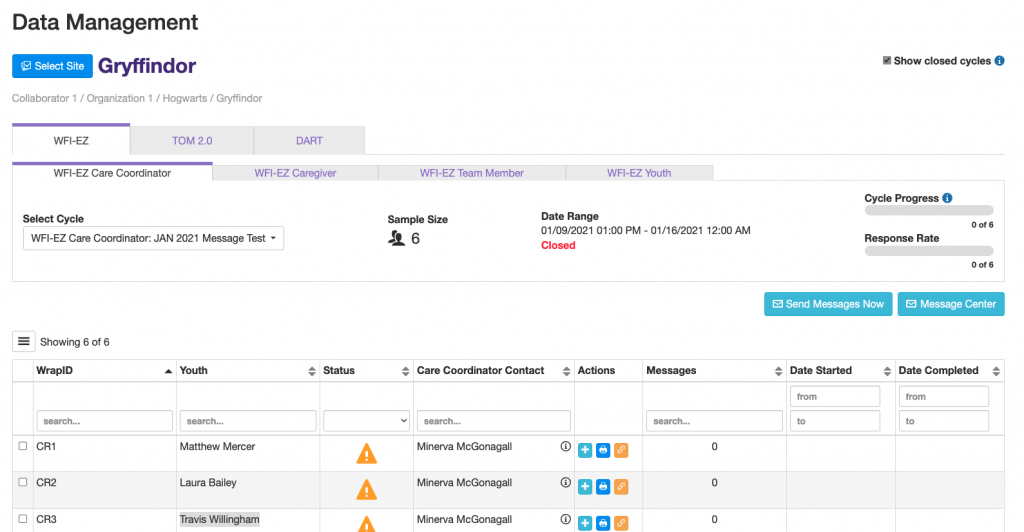
Data Management
This tab allows admins to monitor the progress of survey deployments as well as enter data on behalf of students. They can even send survey reminders to students using their contact information. I designed the top header which shows summary information in a pleasing layout.
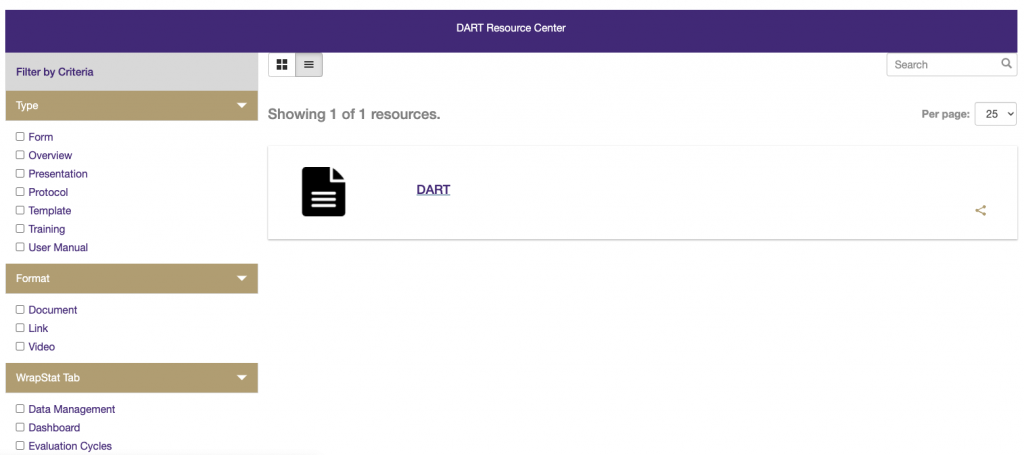
Resource Center
Early in my role at 3C, I developed the front-end for a platform package called “The Resource Center”. It is a reusable component which would allow admins to share documents, links, images, etc. with site users. While the WrapStat project didn’t make full use of it, other apps use this component to share hundreds of documents with users.
From the resource center, admins can upload new resources, name and tag them. Then users can search and filter to find the resource they need.
Reports
So far, you’ve seen how my work on the WrapStat project aids in data collection. Now I’ll give you a peek at how we present that data to administrators so they can glean actionable insights.
WrapStat was the first application developed by 3C to use the reporting feature. Many concepts and best practices were established as part of reports development and the sheer size and complexity of the data forced us to consider scaling solutions.
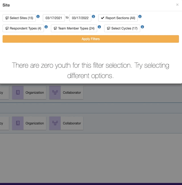
The report starts out empty. The user can change the filters then click “Apply Filters” to generate a new report.
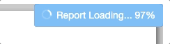
At this point, we launch all the queries needed to build the report. I built this loading indicator to show the progress of the data fetching. Once the report is complete, the user can download the entire report as a PDF.
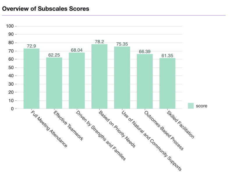
Heres an example donut chart from a report.
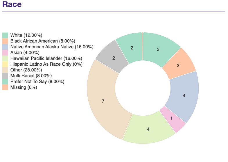
I developed a custom wrapper for Nivo Charts to automatically adjust the chart height and margins to accommodate long x-axis labels.
The scope of the reports was massive. We developed over 6 unique report templates and each template had dozens of charts and tables. Additionally, each report could be viewed at different group levels causing the data to be grouped differently depending on who was logged in. The number of possible permutations was quite large.
Most of this grouping and number crunching was done in the front-end.


Takaways
My role at 3C taught me how to design front-ends for scale. Our team was constantly overcoming technical limits to bring a usable and efficient product to hundreds of thousands of end users.
Leave a Reply